
Sensation is art. I’ve often talked about music as a metaphor for art, but then, music is painting on air, as Sensations Fix said. The whole idea of what you get from art- any art- be it painting, sculpture, music, poetry, or architecture, is at least somewhat based on the sensation you get from it.
With a painting are you relaxed? Is your mind intrigued? Are you outraged? All of these things can be achieved with the choice of subject matter and or colors. Sometimes, like with a lot of the abstract expressionists, they are one and the same.
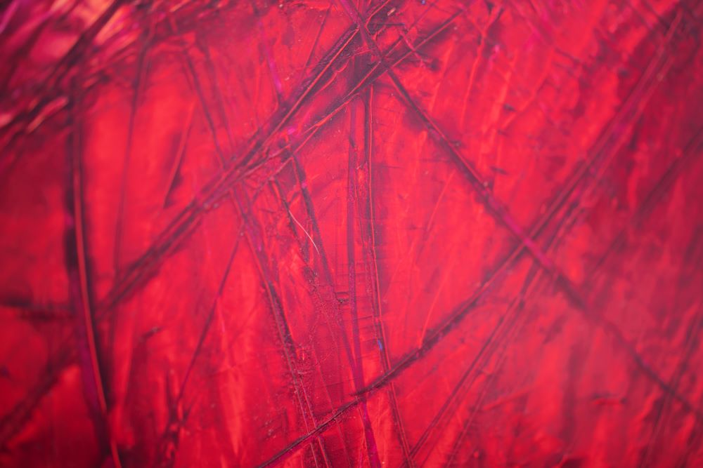
Just putting colors can elicit an emotional response. Red produces hunger and anger. Blue can give a feeling of serenity. Yellow can give you a sense of enthusiasm or boredom. There seem to be both cultural and natural reasons for a lot of the use of color in art.
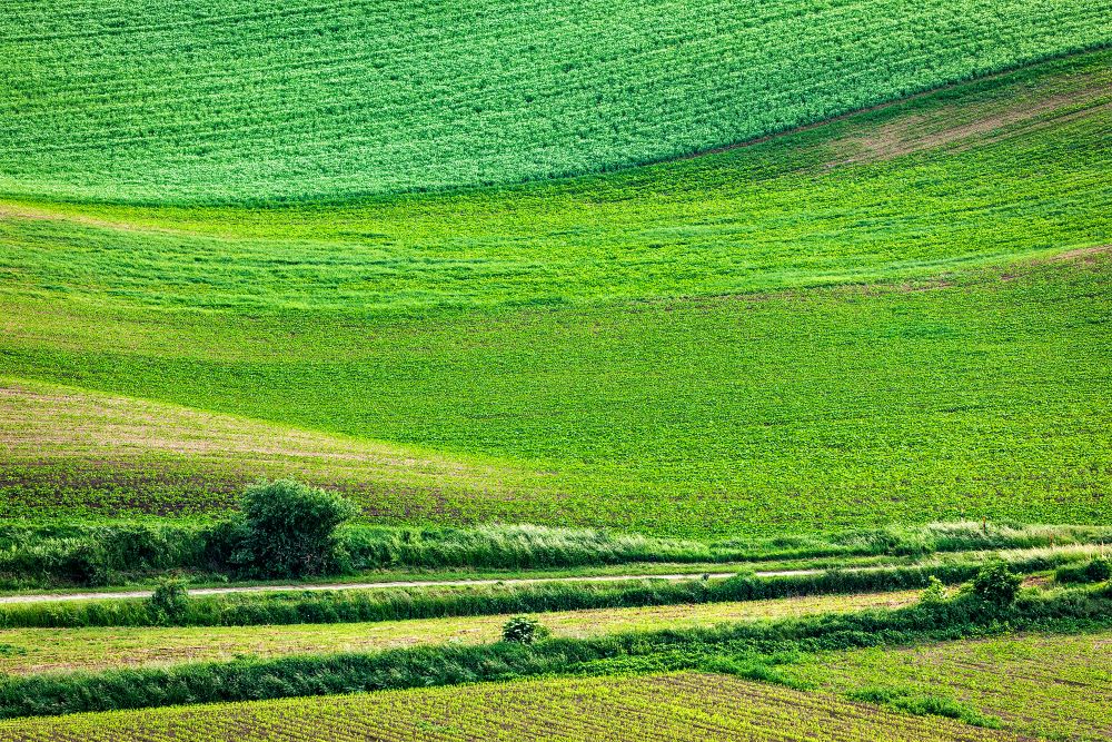
Green, for instance, can mean money, environmentalism, or envy. These are examples of cultural responses. It can also give a vague feeling based on the shade of green. A bright green can produce images of springtime and grass, while a dull green with a low chroma and a lot of shade can make you think of being sick, as you can ‘feel green’ as a way of showing that you are ill. These are simplistic examples, but still valid. As the ABC’s can give rise to the concept of words, which develop into sentences and eventually books, the art colors can give the sensations of complex emotions over time as the viewer understands the meanings more clearly. Instead of ‘I have a vague sense of happiness.’, there might be an understanding of what causes the happiness.

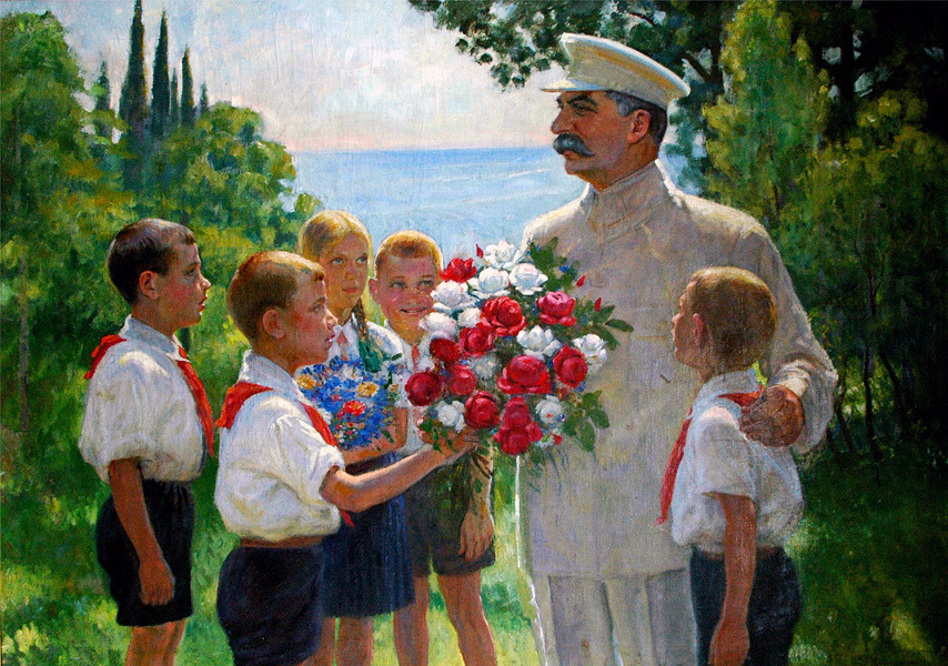 Maybe it’s a propaganda piece put out by the USSR to show the power and joy that you were supposed to feel as a worker or soldier. The red can give you a feeling and strength and belonging as it was the symbol of communism, with the shared blood of your comrades. It also shows solidarity, as it used by other countries that shared the communist dream as well. The expressions on the faces of the subjects are happy and proud. A quiet joy at doing whatever your job is for the collective, wheter it’s a farmer in the field or a laborer in the factory- or a soldier protecting the workers from all foreign and domestic turmoil. It’s unmistakable. This is used in advertising quite a bit, which is just propaganda for a product instead of a cause. One of the best examples is the feeling of ‘fun’ which is hard to describe as a feeling.
 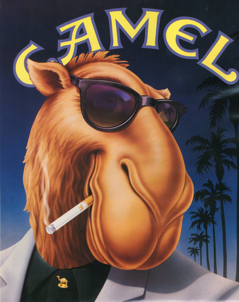 Camel Cigarettes had their ‘Joe Camel’ campaign in the 80s that definitely gave the sensation of fun and belonging. All of these anthropomorphic camels hanging out and having a good time. Lots of blue and white was incorporated into the art. Not just the piece here, but in all of the Joe Camel pieces. Blue is generally considered a ‘cool’ color, giving it a double entendre’ of being ‘cool’ in a Fonzie kind of way, with the message being that if you smoke Camels you will be cool as well. This is less easy to understand with more contemporary art. It range the gamut of being totally about color such as ‘Work and Play’ by Taetzsch to totally about the subject matter, such as Marina Abramovic’s performance art piece ‘Art Must be Beautiful’ . Work and Play seems to be a study of the colors themselves. The zig zag lines seem to denote a sense of playfulness, with lots of primary colors. Color arrangements like this are usually reserved for childrens’ toys, again giving a sense of play. The feel is almost like finger painting. It seems to be very childlike in it’s nature, without being childish. There are clear delineations between the separate areas of the painting, as you can see a sense of structure. This isn’t just a glob of painting eventually getting into an unrecognizable mess. But the first glance feeling is of playing and fun. This could be for the viewer, or the artist might be trying to show that his work is play. Art Must be Beautiful seems to be commentary on art itself. Red in nature- it seems to be painted in blood. The artist is holding a bloody animal bone in her hand; the actual piece is the words written on a sheet in letters that evoke an image of a serial killer writing something on the wall for the police in the blood of the victim. The words written in this manner, ie in a way that isn’t beautiful- make you think that it’s more of a commentary on art- which a lot of art has been over the past few decades. Art about art. It challenges the ideas- the concept of what art is.